最近在学习和使用 WWDC 22 上全新的 Swift Charts,
Swift Charts 使用 SwiftUI 的声明式语法,用于在 SwiftUI 中构建可视化图表,便于数据的可视化分析。
本期博客将专注于 Swift Charts 的标记和符号。

开始创建图表
在正式开始创建图表之前,需要先建立一个图表区域。
1
2
3
4
5
6
7
8
9
| import Charts
struct ChartView: View {
var body: some View {
Chart {
}
}
}
|
Marks 需要被放置在 Charts 内作为元素。
当有多个 Marks 重叠时,其表现形式类似于 ZStack。
你可以在创建 Chart 时直接导入数据,也可以在 Chart 内使用 ForEach 来导入数据。
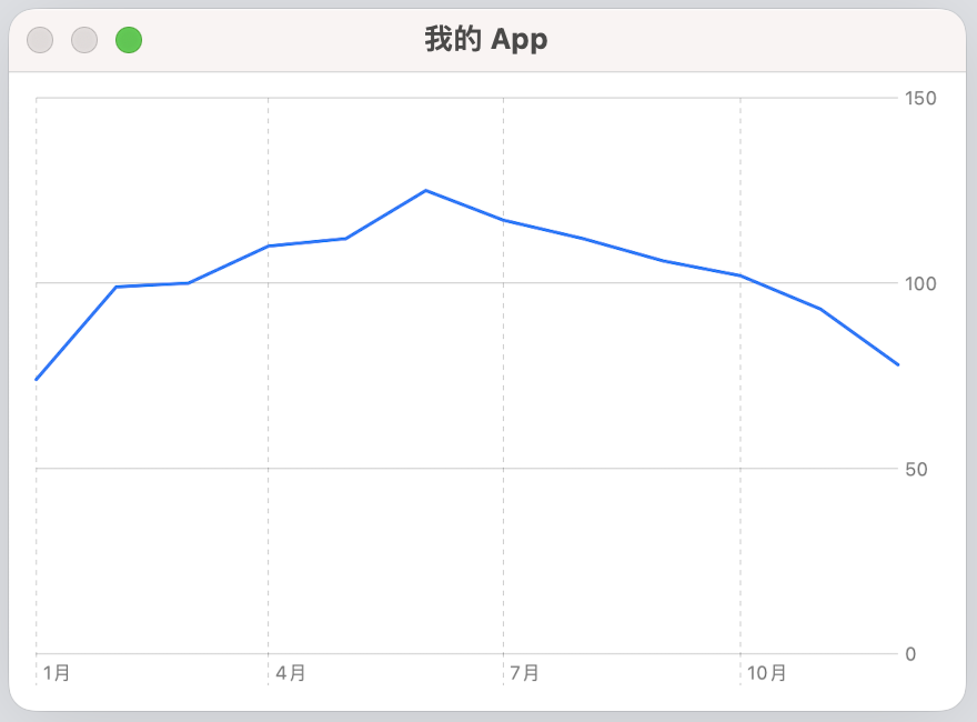
标记(Mark)
LineMark
多个点连成一条线,简单直接。
1
2
3
4
5
6
7
8
9
10
11
12
13
14
15
16
17
18
19
20
21
22
23
24
25
26
27
28
29
30
31
32
33
34
35
36
37
38
39
| import SwiftUI
import Charts
struct SunshineChart: View {
var body: some View {
Chart(data, id: \.date) {
LineMark(
x: .value("Month", $0.date),
y: .value("Hours of Sunshine", $0.hoursOfSunshine)
)
}
}
}
struct MonthlyHoursOfSunshine: Hashable {
var date: Date
var hoursOfSunshine: Double
init(month: Int, hoursOfSunshine: Double) {
let calendar = Calendar.autoupdatingCurrent
self.date = calendar.date(from: DateComponents(year: 2023, month: month))!
self.hoursOfSunshine = hoursOfSunshine
}
}
let data: [MonthlyHoursOfSunshine] = [
MonthlyHoursOfSunshine(month: 1, hoursOfSunshine: 74),
MonthlyHoursOfSunshine(month: 2, hoursOfSunshine: 99),
MonthlyHoursOfSunshine(month: 3, hoursOfSunshine: 100),
MonthlyHoursOfSunshine(month: 4, hoursOfSunshine: 110),
MonthlyHoursOfSunshine(month: 5, hoursOfSunshine: 112),
MonthlyHoursOfSunshine(month: 6, hoursOfSunshine: 125),
MonthlyHoursOfSunshine(month: 7, hoursOfSunshine: 117),
MonthlyHoursOfSunshine(month: 8, hoursOfSunshine: 112),
MonthlyHoursOfSunshine(month: 9, hoursOfSunshine: 106),
MonthlyHoursOfSunshine(month: 10, hoursOfSunshine: 102),
MonthlyHoursOfSunshine(month: 11, hoursOfSunshine: 93),
MonthlyHoursOfSunshine(month: 12, hoursOfSunshine: 78)
]
|
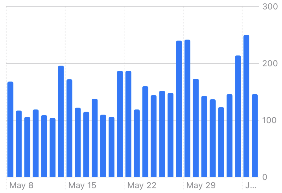
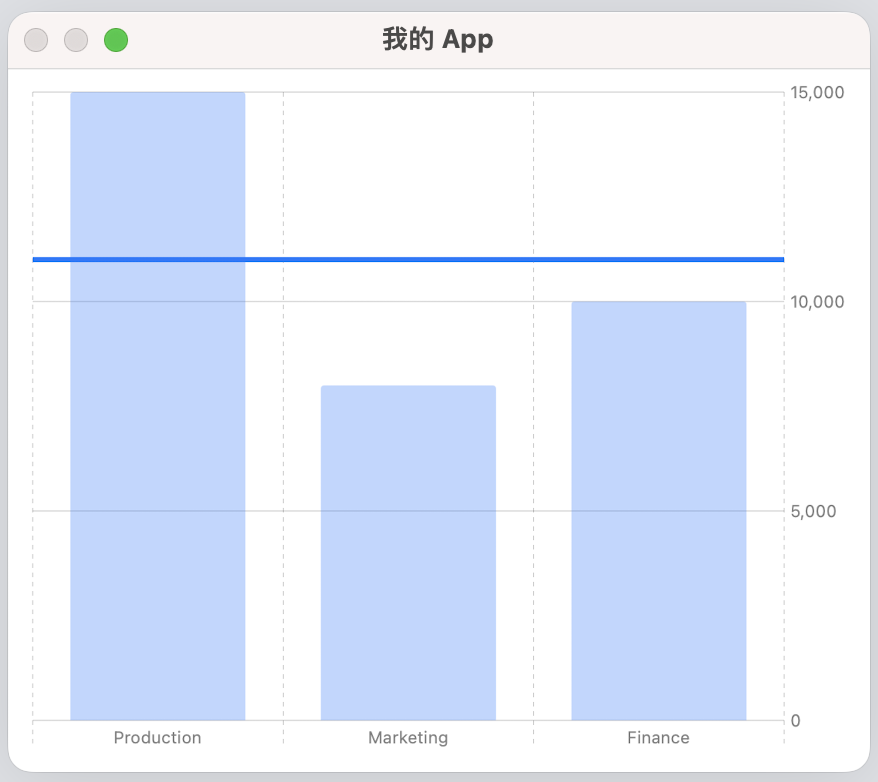
BarMark
条状图,可以很清晰的展现出各个项目的数量多少。
1
2
3
4
5
6
7
8
9
10
11
12
13
14
15
16
17
18
19
20
21
22
23
24
| import SwiftUI
import Charts
struct ContentView: View {
var body: some View {
Chart(data, id: \.self) {
BarMark(
x: .value("Department", $0.department),
y: .value("Profit", $0.profit)
)
}
}
}
struct Profit: Hashable {
let department: String
let profit: Double
}
let data: [Profit] = [
Profit(department: "Production", profit: 15000),
Profit(department: "Marketing", profit: 8000),
Profit(department: "Finance", profit: 10000)
]
|
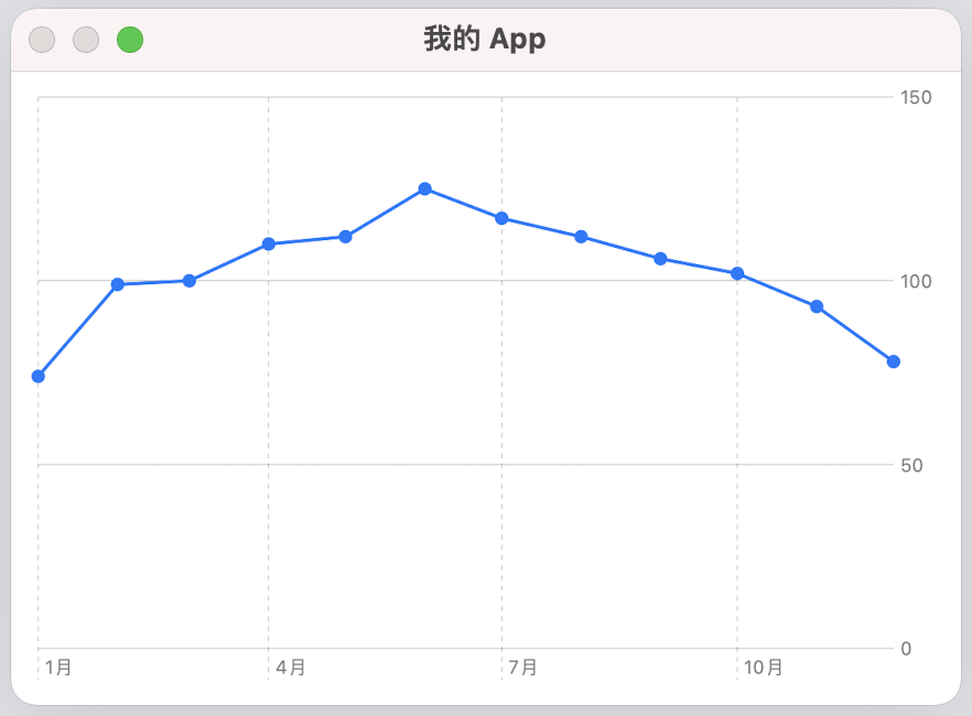
PointMark
点标记,用于标定图标上的某一个或一系列点。
1
2
3
4
5
6
7
8
9
10
11
12
13
14
15
16
17
18
19
20
21
22
23
24
25
| import SwiftUI
import Charts
struct SunshineChart: View {
var body: some View {
Chart(data, id: \.date) {
LineMark(
x: .value("Month", $0.date),
y: .value("Hours of Sunshine", $0.hoursOfSunshine)
)
PointMark(
x: .value("Month", $0.date),
y: .value("Hours of Sunshine", $0.hoursOfSunshine)
)
}
}
}
|
RuleMark
基准标记,就是一条线,可以直观的展现出例如平均值、波动情况等数据。
1
2
3
4
5
6
7
8
9
10
11
12
13
14
15
16
17
18
19
20
21
22
23
| import SwiftUI
import Charts
struct ContentView: View {
var body: some View {
Chart(data, id: \.self) {
BarMark(
x: .value("Department", $0.department),
y: .value("Profit", $0.profit)
)
.opacity(0.3)
RuleMark(y: .value("Average", 11000))
.lineStyle(StrokeStyle(lineWidth: 3))
}
}
}
|
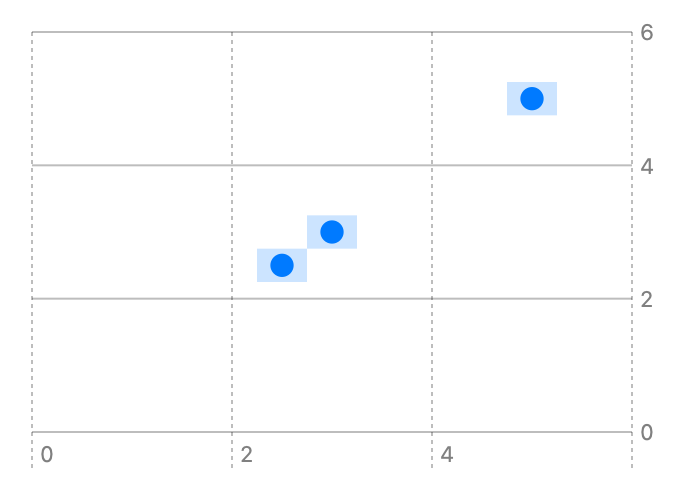
RectangleMark
与 PointMark 类似,只是形状变成了矩形。
当然,他也可以被用来展示一个区域。
1
2
3
4
5
6
7
8
9
10
11
12
13
14
15
16
17
18
19
20
21
22
23
24
25
26
27
28
29
30
31
32
| import SwiftUI
import Charts
struct ContentView: View {
var body: some View {
Chart(data, id: \.self) {
RectangleMark(
xStart: .value("Rect Start Width", $0.x - 0.25),
xEnd: .value("Rect End Width", $0.x + 0.25),
yStart: .value("Rect Start Height", $0.y - 0.25),
yEnd: .value("Rect End Height", $0.y + 0.25)
)
.opacity(0.2)
PointMark(
x: .value("X", $0.x),
y: .value("Y", $0.y)
)
}
}
}
struct Coord: Hashable {
var x: Double
var y: Double
}
var data: [Coord] = [
Coord(x: 5, y: 5),
Coord(x: 2.5, y: 2.5),
Coord(x: 3, y: 3)
]
|
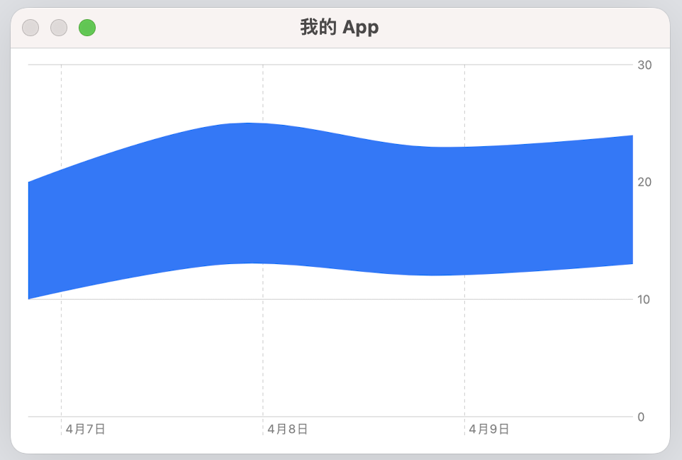
AreaMark
通过多个点组成线,并对其包裹的区域做填充,用来展示某一个区域。
如果是简单的矩形区域,也可以直接使用 RectangleMark。
例如:天气app中,每天的最高温、最低温区间。
1
2
3
4
5
6
7
8
9
10
11
12
13
14
15
16
17
18
19
20
21
22
23
24
25
26
27
28
29
| import SwiftUI
import Charts
struct WeatherChart: View {
var body: some View {
Chart(data) { day in
AreaMark(
x: .value("Date", day.date),
yStart: .value("Minimum Temperature", day.minimumTemperature),
yEnd: .value("Maximum Temperature", day.maximumTemperature)
)
.interpolationMethod(.catmullRom)
}
}
}
struct Weather: Identifiable {
let date: Date
let maximumTemperature: Double
let minimumTemperature: Double
let id: Int
}
let data = [
Weather(date: .now, maximumTemperature: 20, minimumTemperature: 10, id: 1),
Weather(date: .now.addingTimeInterval(24 * 60 * 60), maximumTemperature: 25, minimumTemperature: 13, id: 2),
Weather(date: .now.addingTimeInterval(2 * 24 * 60 * 60), maximumTemperature: 23, minimumTemperature: 12, id: 3),
Weather(date: .now.addingTimeInterval(3 * 24 * 60 * 60), maximumTemperature: 24, minimumTemperature: 13, id: 4),
]
|
符号(Symbol)
如果涉及到多样本处理,例如:比较多个城市的气温曲线,
为了让图表看起来更加直观,通常会使用一些符号或者颜色来做区分。
有以下几种方式:
以颜色区分:foregroundStyle
1
2
3
4
5
6
7
| Chart(data, id: \.date) {
LineMark(
x: .value("Month", $0.date),
y: .value("Hours of Sunshine", $0.hoursOfSunshine)
)
.foregroundStyle(.value("City", $0.city))
}
|
以形状区分:symbol
1
2
3
4
5
6
7
| Chart(data, id: \.date) {
LineMark(
x: .value("Month", $0.date),
y: .value("Hours of Sunshine", $0.hoursOfSunshine)
)
.symbol(.value("City", $0.city))
}
|
创建之后在图表左下角会出现 Legend,
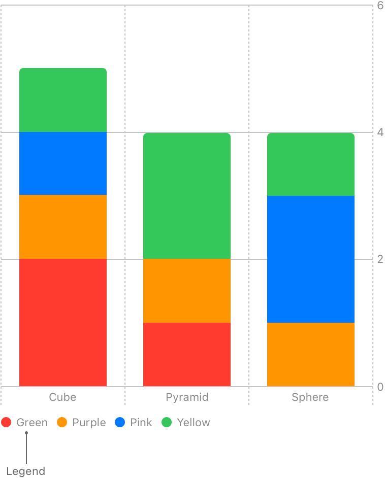
通过上述的两个 modifiers 也可以自定义颜色和形状,都会展示在 Legend 中。
如果想隐藏 Legend,可以使用 .chartLegend(.hidden)